Iconography, Letter Art, Logos, and Motion Graphics
Graphic Design
HalfTone Graphics and Iconography
HalfTone is UX/UI Design Project designing a project management application for creatives. For this project, I designed the logo, iconography, and user interface and user experience for users.
The project included initial project background research, both primary and secondary. After analyzing the data, I completed an iterative design process, and honed branding and graphic design details for the application. For a detailed look check out this case study, where I explain my process and results.
Below is the Logo and the icons I designed, some in alternating color schemes for higher contrast and accessible visibility. For the HalfTone iconography, I focused on a casual style with a mix of clean edges, round curves meeting sharp straight lines. I wanted them to feel cohesive as a set, and match the overall brand design.








Bright as Blaze and Blaire Coleman Brand
BrightasBlaze is my brand for my Plant-Based Cooking Blog and Youtube Channel.
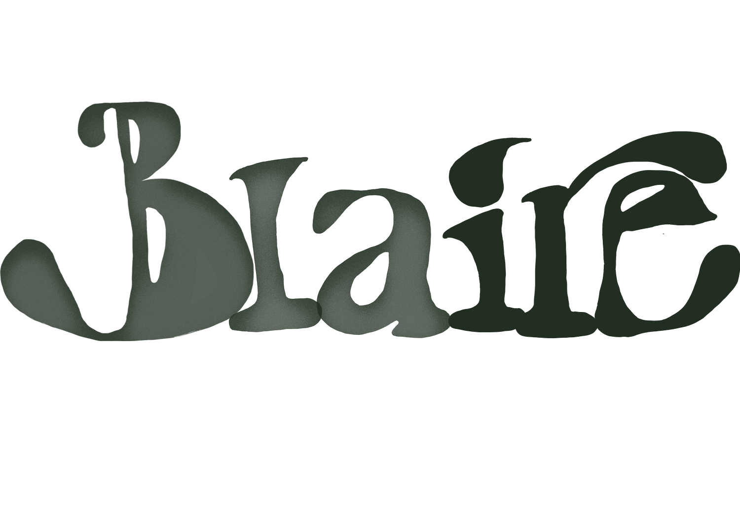
Brand design focused on expressing my personality through Letter art design, so I designed a custom font that I used for my professional website, Blaire Coleman, and my blog brand, BrightasBlaze. The typeface is fun, a little funky, leaning to my appreciation of the 70’s in my personal design style. It is artistic, and playful, with lots of round curves and tumbling shapes that have a freeform look. This is to represent my brand, casual, bold, and artsy, with a retro aesthetic.
PB&J Sandwich Instruction Graphics
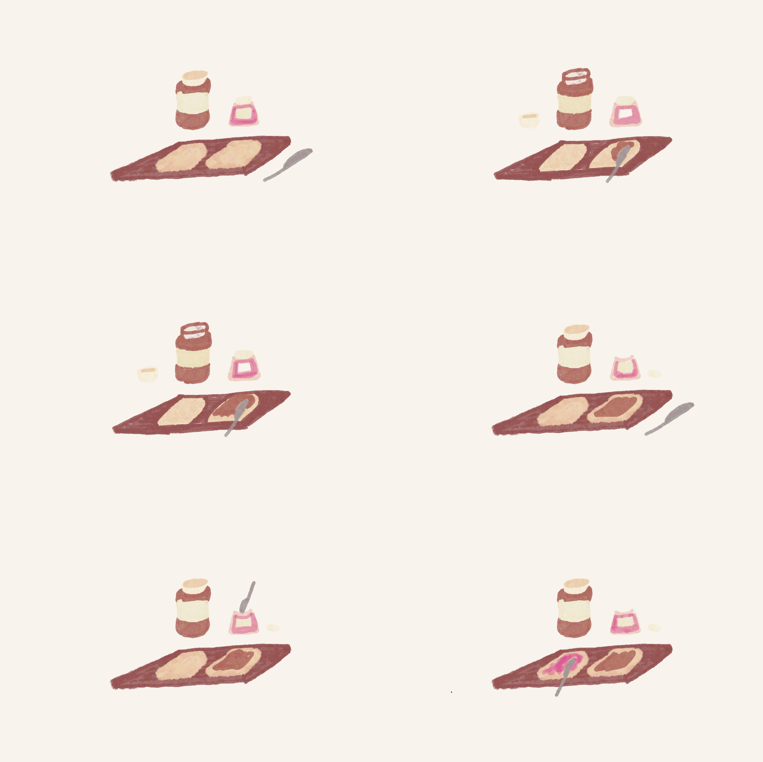
For a small web design project I made a couple of motion graphics that demonstrated the making of a peanut butter sandwich.
Writing instructions for a making a peanut butter sandwich is an elementary school project that demonstrates the value of clear and detailed instructional writing. With my background in technical writing, I felt this was a cute project to sharpen my web design and user experience design skills, and dove into the world of motion graphics for a cute, sketch style, finishing touch.
Emendate Brand
Emendate is a UX/UI design project for a collaborative book writing author and editor web application.
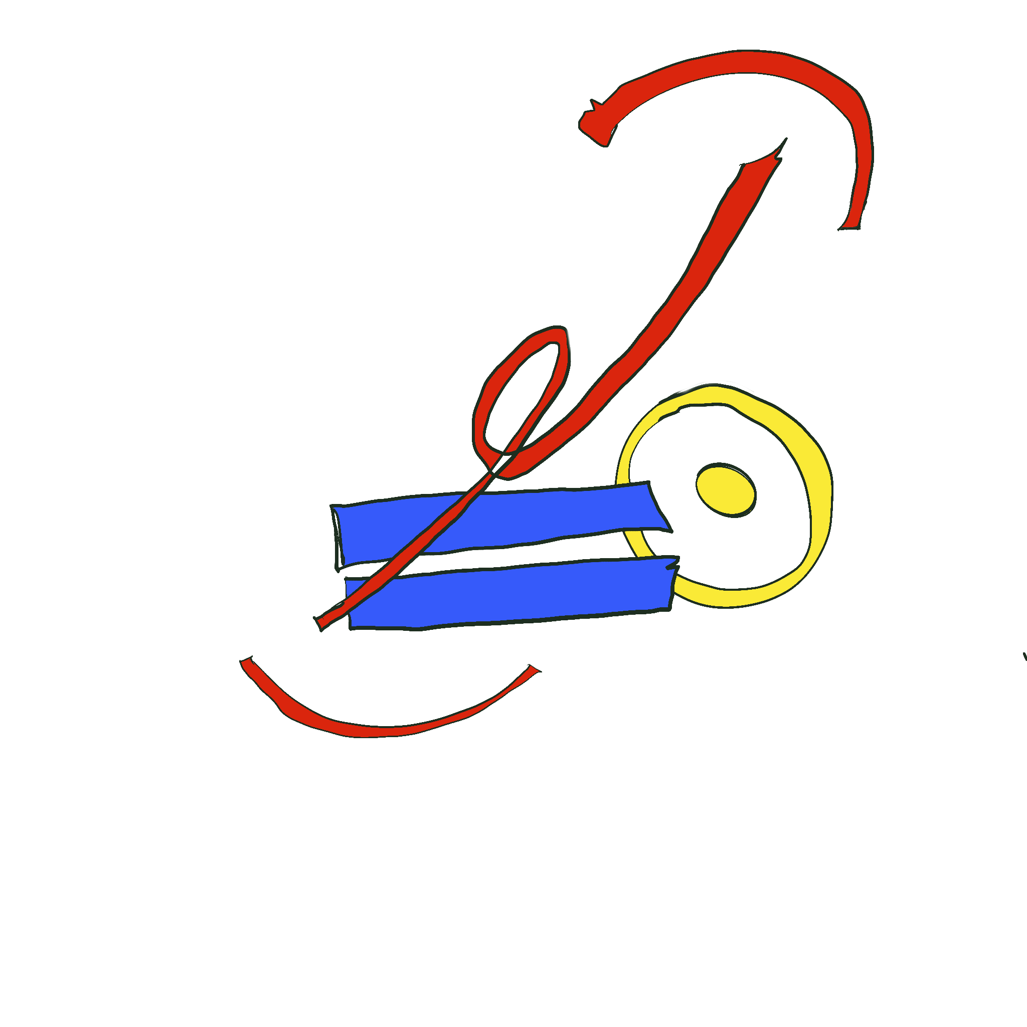
I designed the logo using common traditional handwritten editing symbols, for “capitalize this”, “remove this”, and “add a period”. I utilized primary colors to provide an academic and trustworthy feeling. I also held true to the traditional editing process, using paper manuscript and pen, by using a hand-drawn aesthetic for the text and editing symbols.
The final UX/UI project will include more iconography design that continues this look.
Diaphaneity Magazine
Diaphaneity is literary and art magazine, celebrating black writing, social commentary and art.
The magazine would include personal essays, poetry, photography, and art prints, a deep dive into culture in alignment of various emotional themes that change with each issue.
As a nod to black design, the logo was designed with Nubian and African Architecture as inspiration, filled with dramatic archways and organic looking walls, made often from moldable materials. The color logo aligns Diaphaneity color scheme.
